nyu_torch.gif

Blog

Posts in Computational Media
ICM and PCOMP Final: Santa's Zombie Boot Camp

This was a shared between project with Martin Martin and I. It was a Physical Computing final for both of us, and also an Computational Media final for me. This blog will focus on the ICM aspects of the project. For the PCOMP take on the project, visit Martin’s blog (link here)

Santa’s Zombie Boot Camp

p5 Sketch (link here)


This project was tough. I had an idea of what I wanted, and I didn’t think it would be too far from what we had for the midterm (link here) but I was wrong. I decided to remove the jump mechanic from the game because it didn’t make too much sense for our zombie to jump, and we added a Santa theme to the game which called for almost a complete redesign.

Getting the physical components together was frustrating, but not overly difficult. If anything it was just a little more time consuming. Thinking that most of the work would be on the physical side, we didn’t leave too much time for the coding. This was a mistake. I think with more time and less pressure, I may have been able to work my way out of coding challenges on my own. Luckily, we have people at ITP like Max Da Silva and Aditya Jain. They were immensely helpful in getting this game to the place that it is at.

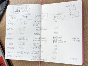
Something that helped this time was just making a list of my goals for the code. There were a lot of small tasks to accomplish, so having them laid out in a checklist helped me keep from feeling overwhelmed.

A List of Coding Goals for the game that breaks up the functions and addresses the general scope of the project

A List of Coding Goals for the game that breaks up the functions and addresses the general scope of the project

One of the issues that I ran into was getting the gifts to spawn when the Zombie got close enough to Santa. I was able to define the range in the code and even have it print “gift delivered!” every time the objective was met, but I couldn’t figure out how to make the pictures of presents show up a that point. Aditya helped me create an array for that and just clean up the experience overall.

Aditya also helped me figure out an issue with our start button and foot stomps. With my code, every time either of those sensors were activated, they would do so on the draw loop in a rapid-fire succession. I didn’t know how to get around that, so Aditya showed me how to use a throttle to have those sensors write once every second, which was key in having the game run properly.

Max helped us get the serial communication into our code. We had most of it there from our midterm, but we were having trouble with our gyroscope when we added it in. Max helped clean up our code to make that work.

Screen Recording of Santa’s Zombie Boot Camp

Alvaro playing Santa’s Zombie Boot Camp

ICM Sound Experience

FANTASIA!!

For this project, Douglas and I spent a lot of time conceptualizing before we started coding. We looked at exploring the circle of 5ths, working with chords, making a harpejji, and many other ideas. When looking for examples online, we actually came across a project by ITP 2nd Year Student, Adi Dahiya in where he used posenet to make a soundboard. We loved the idea and decided to iterate on it. His version played sounds that he loaded in, sound effects like a minion from Despicable Me and other sounds. We wanted to do something similar, but with oscillators instead.

So instead of a sound board, we made a keyboard that played the notes from C4 - C5 (skipping the half steps along the way, only keeping 8 notes). The way it works is you place your wrist over the note that you want to play, and dropping your nose below the halfway mark of the screen plays the sound, while raising the nose above it cuts the sound. I thought it was pretty fun to see someone bobbing their head to play the notes on our instrument. During play testing, I thought that the black nose on Douglas gave him a bit of a Mickey Mouse look, so we added the Fantasia hat and Mickey Gloves to perfect the look.

Here’s a link to the project.

https://editor.p5js.org/patconwar/sketches/4z70lmERf

Play Test Video

Fantasia themed keyboard coded with p5 and posenet to create a 8 note keyboard played with hands and nose.
OBEY, what I say

This week I worked with Vanessa on a color experience. For our inspiration, we went with something that Felipe Pantone posted on Instagram (link here) where they printed Cyan, Magenta and Yellow (CMY) values individually onto separate glass panels, suspended the glass by cables and then moved them to show the relationships between the colors.

To replicate this effect, we had to change the blend mode in p5 to “DARKEST” which allowed the CMY values to blend and create the desired colors. We used the Obey Giant logo by Shepard Fairey because it’s easily recognizable and it’s all one color, making it easy to create CMY versions. We then found a song called “The Obedience Song” by Craig Louers on YouTube (link here) that gave the sketch a somewhat jolly/creepy vibe that was interesting.

By moving the mouse along the Y-Axis, the three different colored grids are moved in different ways, by moving the mouse on the X-Axis, the scale is altered.

The sketch can be found here.

Computational Media Midterm Review

LINK TO ICM/PCOMP PROJECT “ZOMBIE BOOT CAMP”

(note, this is an updated version from the ICM midterm that was altered to fit with the theme of the PCOMP midterm)

Overall, I feel that I’ve learned a tremendous amount about computation in this first half. In struggling with p5 in different ways every week, I feel that I’m beginning to develop a sense of how to break ideas down into component steps that then makes the process of writing code a little more efficient. In the first few weeks, I relied heavily on other skills that I had (photoshop, after effects) to lay out my thoughts and hopefully be able to transfer that into code. In the past few weeks, I haven’t had to go to those steps and am finding it more effective to just go from my notes to coding as I begin to understand more.

I think that combining my PCOMP midterm with my ICM midterm helped me understand both classes a lot more. I still feel like I’m barely treading water in both, but the process of having to figure things out, ask for help, and then figure out new problems that arise after that help, forced me to figure out how I learn things. Demonstrations and reverse engineering seem to be most helpful to me, especially when my brain energy is starting to dwindle.

With my understanding on computation at this point, it feels like another took to add to my kit as a creator. Like all other tools, they have the ability to hurt, heal, or help, depending on how they are used. As far as how it relates to my creative process, computation forces me to slow down and consider the base components of everything that I’m doing. It may not be the most helpful if I’m running on a tight deadline, especially when I have tools that I’ve used for longer that I know how to produce work more quickly. I do value the idea of knowing my work on the level that computation forces me to be familiar.

Fellow ITPer Max Da Silva enjoying a round of Zombie Boot Camp after helping us troubleshoot our code.
Screen record of Physical Computing Midterm by Martin Martin and Patrick Warren. Zombie Boot Camp is a pacing game about a zombie who is trying to get into better shape with the help of legendary Punch-Out Trainer Doc Louis. Major thank you to Max Da Silva for helping debug the code!!
Computational Media 10.3.19

Punch-Out (Reorganized!)

This week, my main goal was to reorganize my previous week’s sketch. After learning about creating functions, it made sense to me that I could make my work a bit cleaner. In the process, I realized some extra functionality that I could add to the sketch to make it closer to a game than just a simple animation.

Here’s a link to the project

I didn’t actually end up with less lines of code but I can see how if I were to expand upon the idea, the usage of functions and objects would be of great use.

Gamification

I added an element to the movement of both characters where it becomes a task to keep them in pace with each other. If I were to expand upon it, I would create an endgame or a goal for the player to reach. I would also create indicators to let the player know when they are in danger of losing as well as a screen to let them know they’ve lost.

Video screengrab of Punchout P5 code with example of gameplay

Computational Media 9.26.19

PUNCH OUT!!!

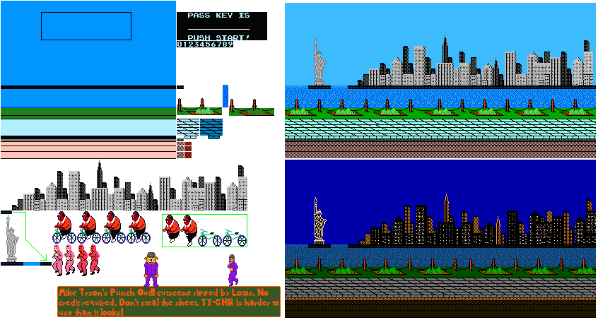
This week I figured I could use for loops to recreate a scene from the NES video game, Punch Out. I downloaded a sprite sheet from Spriter’s Resource because I did not want to draw out a whole 8-bit scene in p5, I was mainly concerned with making the parts move accordingly. I then cut the sprites out into individual pieces based on how they moved. I couldn’t quite wrap my head around the movement in ways that I could translate into p5, so I had to put it together in After Effects just to get a sense of the step-by-step. Once I had that down, it was easier for me to focus on getting them individual assets in order.

The Sprite Sheet that I pulled from with different elements of the Punchout animation

The Sprite Sheet that I pulled from with different elements of the Punchout animation

I figured the for loop would be helpful in creating a constant stream of background for the two characters to travel through. I had some trouble with this, and ended up using very exaggerated numbers to get the result that I wanted. I imagine there’s a better way to go about this.

Before I called it a night, I decided to add music as a function of MousePressed.

To view the animation properly, the assets must be added to p5. Here is a shared google folder for that.

Link to the project page

Punchout p5 project screen recording. Code and demo

Computational Media 9.12.19

Pat Con No-Face

For this assignment I teamed up with Jan. We decided early on that we would literally combine our week 2 compositions by adding my beanie to her No-Face sketch so it was very clear that it was a collaboration between the two of us.

Getting the beanie onto the sketch was more of an issue than we initially thought it would be. We wanted to retain the movement of the figure that Jan had in Week 2 and I didn’t want to have to fully resketch the beanie, and that proved to be an issue. We thought that we could just modify the scale of the beanie , throw it on the figure and add the mouseX value to keep the movement with the figure. What we didn’t anticipate was that the scale modification would also change the movement speed. To remedy that, I created a beanieSpeed value that I just kept adjusting until we had something that matched the speed of the figure. I wish I knew how to calculate that speed without simply guessing, but it wasn’t too painful this way.

The next goal on my end was to have a background that changed color every time we opened it. I thought that I could set a global variable on random, but it seems that it wasn’t a valid move to make. When I set the values to random under the draw function, we ended up getting a flashing mess that was more EDM party than it was cute and novel, so we scrapped that idea for now.

Seeing that the scale function messed with the speed, I thought it would be cute to add a little baby version of No Face that kind of trailed behind the figure, or looked like it was following it from inside the room, so I added that as well.

Jan added a mouseIsPressed statement that allowed the user to click the mouth of the No Face wide open or just the default kind-of open pose. I thought about adding the baby No Face to that function, but it seemed a bit much.

Jan also incorporated the trailing effect that Ray showed us with his stars last week. There’s a slight issue in that she only wanted the black part of the figure to trail off but she was also getting the white of the mask trailing. The white trails lasted a bit longer so it created a look that we initially going for, but we kept nonetheless.

View the p5 sketch here

Note: This may not be the final sketch as Jan may do work in the time that this post was written.

Screen Record of Jan’s No Face sketch with Patrick’s Beanie and a baby No Face added.

Computational Media 9.12.19

View the p5 Sketch here

This week I added to last week’s sketch of my logo. I used the YPos Value to have the triangle scroll up continuously in the background with the draw function. I essentially moved the whole sketch to the draw function just to keep the layering in proper sequence.

I used MouseX and MouseY to have the color of my beanie change as the mouse moves, and I added the alpha function to the top half of the beanie to have a slight transparency, I think it helps make the movement of the triangle look more pleasing.

I wanted to have both of my eyebrows moving up and down, but I couldn’t figure out how to do that. I tried translate with a push & pop to isolate all of the curve vertexes for the eyebrows, but I couldn’t get that to work. I ended up using a random array for just one eyebrow, but that produced a twitchy kind of feel which wasn’t exactly what I had in mind. I would love to learn to how to make the eyebrows smoothly move up and down on a loop.

If I knew more p5, I think that instead of having the triangle scroll, I would like to have it constantly generating from the middle and growing out of the frame from there.

Computational Media 9.5.19

What is Computational Media?

Media made by computing. Whether that’s HTML, CSS, p5 or even a punchcard for a loom or a mechanized flute, it’s all about writing a code and having that code translate into something else.

In my limited experience with coding, I’ve worked with HTML, CSS, PHP, and some of the visual coding in Unreal. I’ve always enjoyed the process, as if I was exercising a part of my brain that didn’t really get much use. Growing up, I feel like I’d been conditioned to think of people who code as very straightforward, non-creative thinkers. In my coding projects I feel that I could not have been any more wrong. Coding is a way to simultaneously set boundaries and break them down. Boundaries are set in the way that the code must be written in a certain way for it to function and then broken down by creative interpretations of the code to create in a myriad of ways.

As we’ve come to find new ways and applications for coding, it’s no surprise how much power is held by those who understand how to do it. As a society, we are at a point where those who do not understand code have submitted to letting others dictate huge facets of their lives. The phones we use, the cars we drive, the maps we follow and the media we take in is all in the hands of those who write the code behind those tools.

Due to racism and sexism, we find ourselves in a place where a majority of the people behind the code represent the privileged class more than it does the oppressed. Even without malicious intent, without a diverse group of people writing code inherent biases will slip into the code. When bias in built into foundations that layer upon layer of code is based on, it becomes difficult to find equity in tech. When that tech becomes an increasingly more prevalent part of our lives, the need for diversity becomes exponentially more urgent. Maybe it isn’t necessary for every person to know to code, but every person should know at least a handful people who can help them understand the code that runs their lives.

=============

p5 Sketch

For my sketch, I decided to recreate an old logo that I used for my brand. It’s an image of the top of my head with the eyes blocked out. As expected, I struggled with figuring out how to make this work in p5. Initially I tried to dive in and try certain assets to see if I could figure out how to make it work. This was helpful for simpler things like the triangle, quads and single straight lines. When I tried it with curves it only flustered me. Luckily, I found a video on YouTube by The Coding Train that helped me understand how to make curves work. I still wasn’t able to get exactly what I wanted, but I’m satisfied with the work so far as a first attempt.

A link to the project can be found here.

Here is a photo of the original logo that I designed in Adobe Illustrator:

A logo that features Patrick’s face from the eyes up. The eyes are blocked by a black censor bar. He is wearing a pink beanie. There is a black outlined triangle in the background.

A logo that features Patrick’s face from the eyes up. The eyes are blocked by a black censor bar. He is wearing a pink beanie. There is a black outlined triangle in the background.

Here are some progress shots of the sketch:

On the left there is the p5 web editor filled with p5 code for the sketch. On the right is a triangle with a thin line sketch of part of a beanie.

On the left there is the p5 web editor filled with p5 code for the sketch. On the right is a triangle with a thin line sketch of part of a beanie.

On the left is the p5 web editor along with some code for the sketch. On the right, there is a triangle in the background and part of a pink beanie sketched out. The top left corner of the beanie has a point that is way too high, indicating an error…

On the left is the p5 web editor along with some code for the sketch. On the right, there is a triangle in the background and part of a pink beanie sketched out. The top left corner of the beanie has a point that is way too high, indicating an error in the code.

Here is the final sketch:

final sketch of Patrick’s logo. There is a black outlined triangle in the back. Patrick’s eyes are covered by a black censor bar and he is wearing a pink beanie.

final sketch of Patrick’s logo. There is a black outlined triangle in the back. Patrick’s eyes are covered by a black censor bar and he is wearing a pink beanie.