nyu_torch.gif

Blog

Posts tagged itp
Mock-up: AR Sheet Music

In thinking of physical objects that would work well in AR space, I came across sheet music and couldn’t really shake the idea of how nicely it would work in AR. As someone who’s kept sheet music around for various instruments, one frustration was that sometimes my brain just couldn’t wrap my head around how something was supposed to sound. If I could point my phone at the sheet and have a snippet played for me, it would be able to pick up where I left off right away, just a quick boost to keep my progress up. Here’s a video mockup of what I had in mind.

This was just a quick mockup to get a look going. After looking at it a few times, I think that a further iteration would have individual notes changing color as opposed to the whole bar for more specificity. Maybe some kind of playhead on a timeline would be helpful if the user wanted to go over a specific part.

Image Tracker: Quarantine Journal

This is a project that I started back in the beginning of Quarantine but never got back to. I did one quarantine journal entry from my kitchen, and filmed a few more but never built them out in AR. Here I used a generic image tracker on my kitchen island to trigger a video of me cooking in the kitchen. The idea with this project was that someday, maybe long after I passed away, someone could visit my apartment, and if the trackers were placed properly, this visitor could see what it was like for me during the Covid-19 Quarantine.

Experiments in AR Final: Distanced

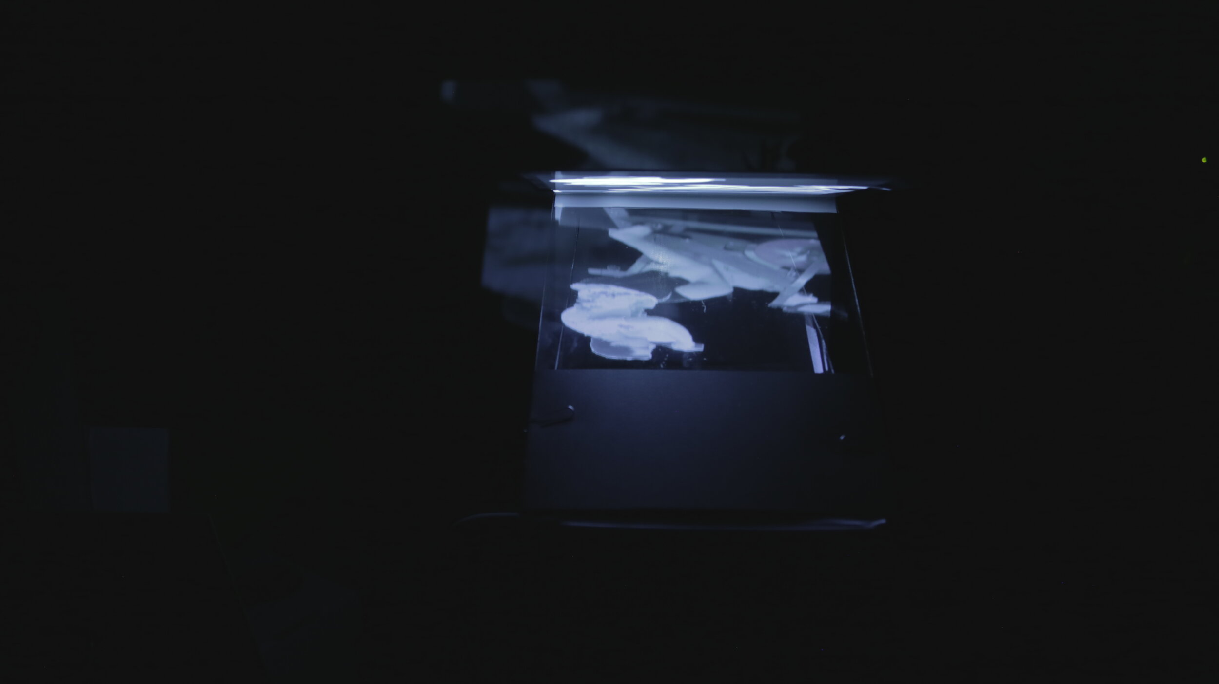
For my Final Project I’m working with Nok Jangkamolkulchai, (full transparency, this is also my final for Electronic Rituals as well as for Video Sculpture) I am creating a collective Quarantine Journal that will live in a physical installation. This installation will make use of the Pepper’s Ghost effect which simulates a hologram floating in space with the use of a projector, a pane of glass and some tricky reflections.

(Sidenote: The final version of the project relies on me being able to access some equipment that was left on campus at NYU, so this is just a working prototype)

Initially I wanted to use AR to create walking tours of neighborhoods from people who were displaced due to gentrification. When Covid hit, it made it dangerous to think about being out in public to do anything, so the scope of the project had to shift. I made a few image-target based AR experiences to show what my quarantine had been like and decided I wanted to open the project up to community contributions.

Distanced is a physical installation that is made up of a collection of quarantine experiences. By projecting a short loop of someone in quarantine, accompanied by a clip of that person speaking about their experience, the goal is that somehow the shared experience is able to make sense of the time. If not make sense of it, at least describe it.

rough sketch of how the projection is displayed using Pepper’s Ghost

rough sketch of how the projection is displayed using Pepper’s Ghost

This period of time is going to be a weird thing to explain to people who aren’t here living through it with us. I want this to be a tool to understand at least a bit of what it was like and to go through it by assigning them a role in it.

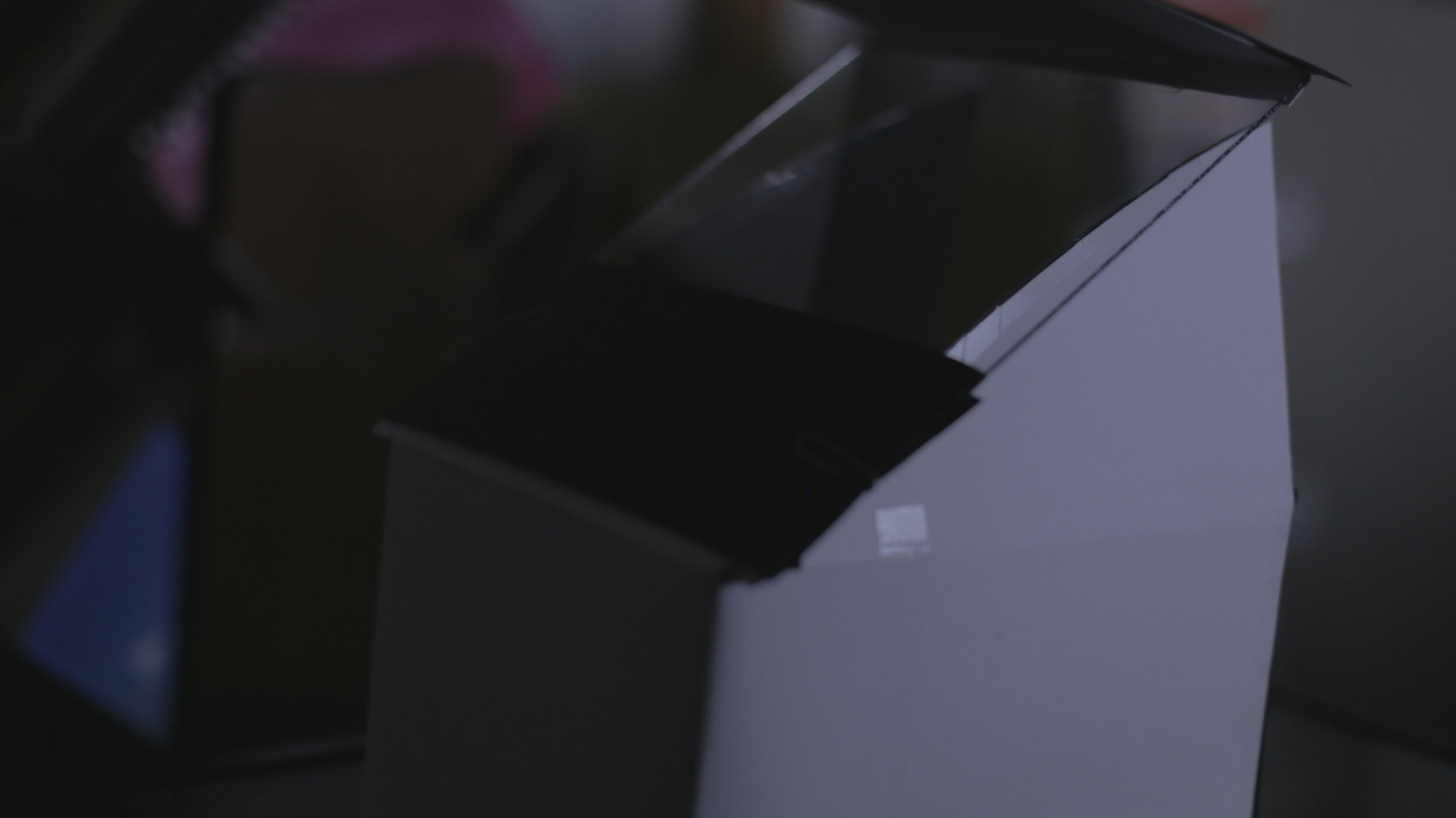
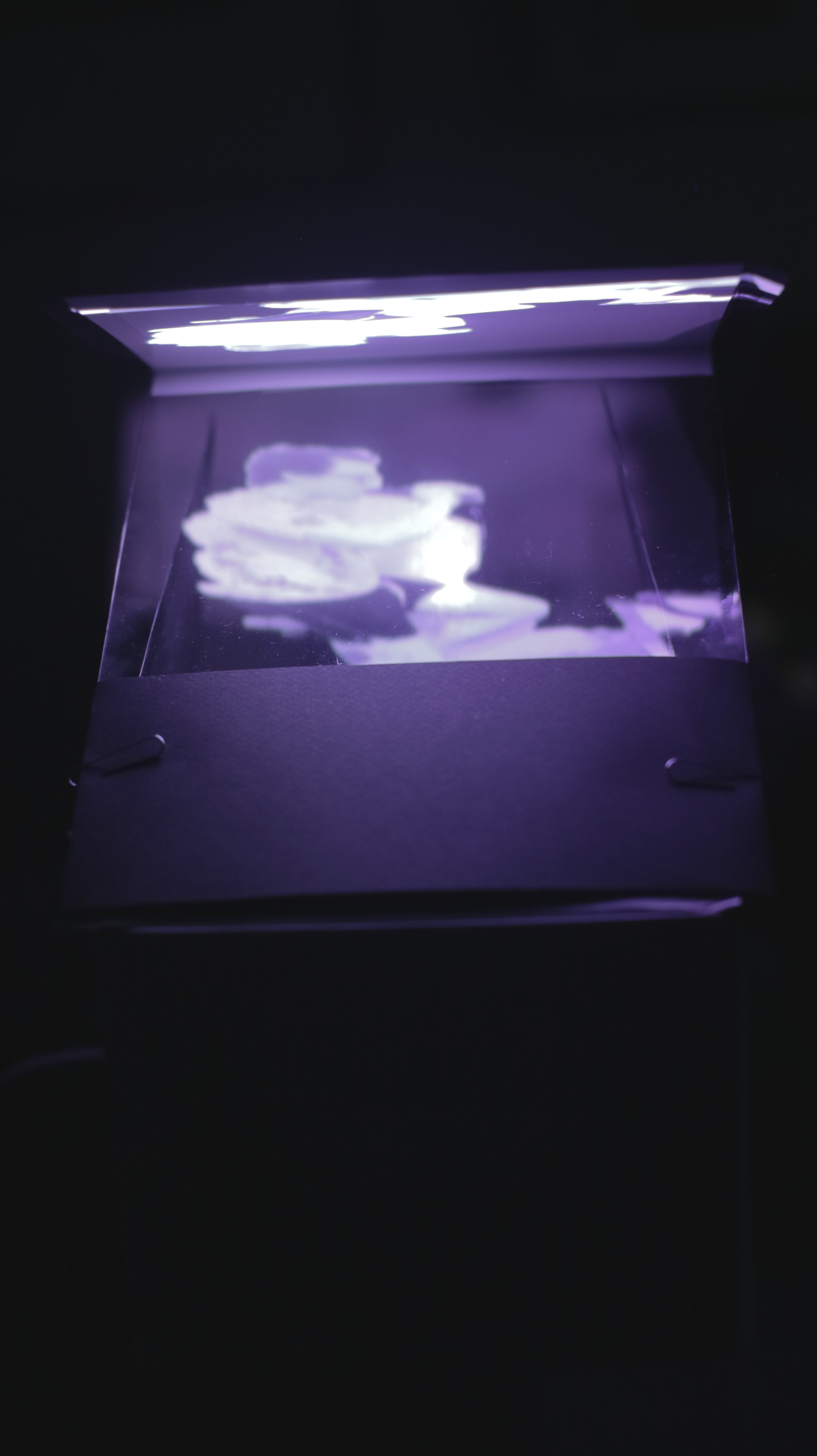
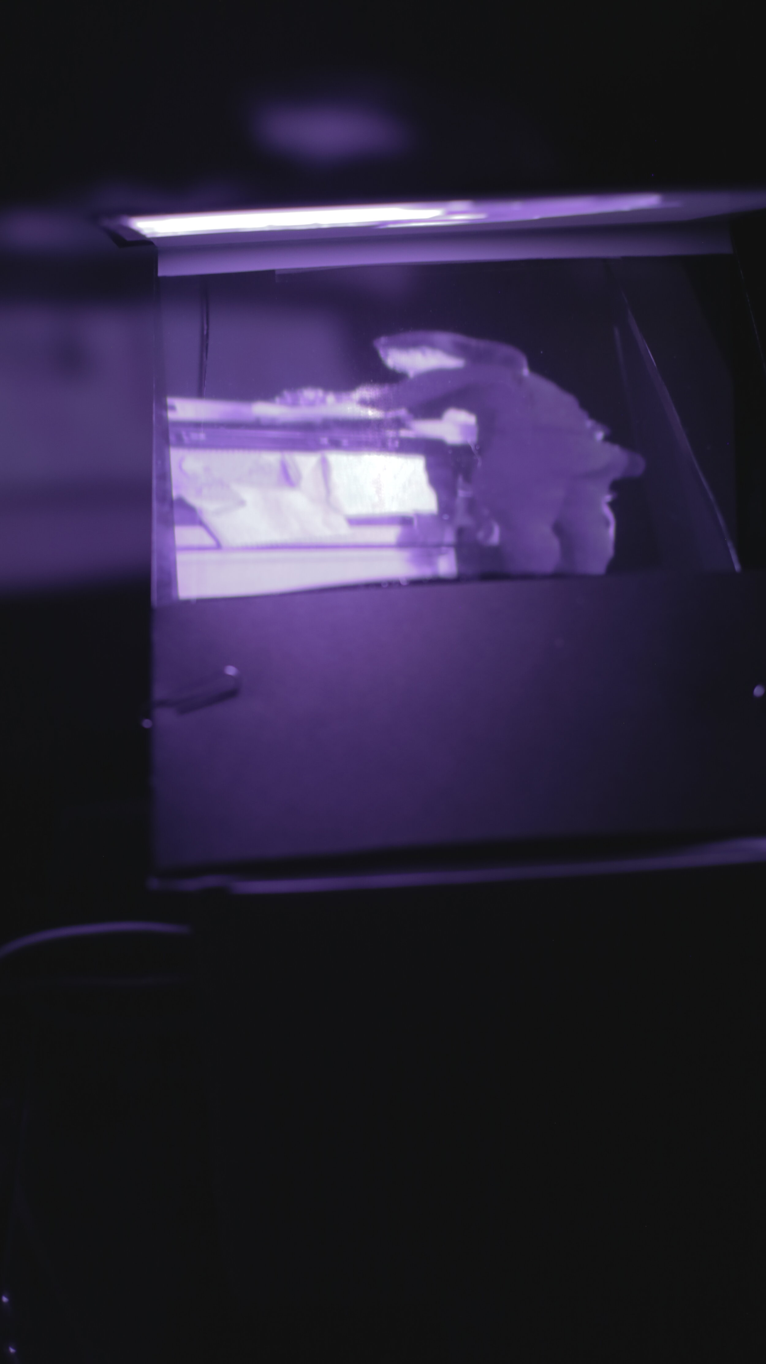
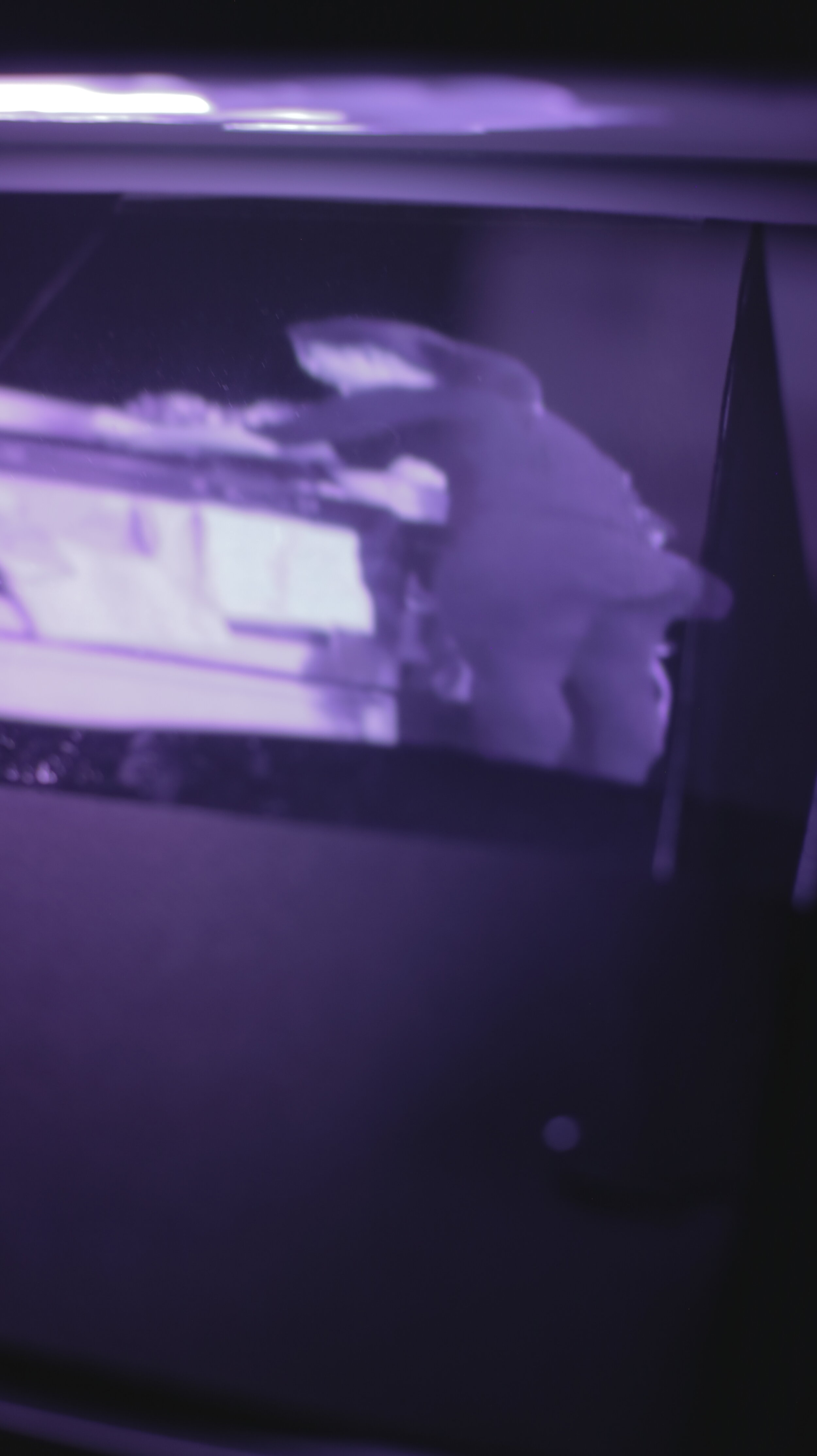
For this prototype, I’m running everything in a Max/Jitter patch. As a placeholder for the copper boards being touched, I instead just run things from a single button press on my keyboard. Programming the patch to respond to the copper will be simple once I have access to the equipment. The prototype is made from cardboard, but I would like to have it made out wood for the actual piece. Inside of the cardboard is a mini projector that is pointed at a small mirror. That mirror reflects the projection through an angled glass pane onto a solid white surface. It is the reflection from that white surface, viewed through the angled glass that causes the projection to look as if it is floating in space, The Pepper’s Ghost Effect.

*For the randomization of the assets, I wanted to play with the number 19, but I was unable to get it working. This is something that I am still exploring and will be working on after I present this in class. For now I am just using the random function within Max, but figuring out my own system is a priority.

EROFT Final: Distanced

For my EROFT Final Project I’m working with Nok Jangkamolkulchai, (full transparency, this is also my final for Experiments in AR as well as for Video Sculpture) I am creating a collective Quarantine Journal that will live in a physical installation. This installation will make use of the Pepper’s Ghost effect which simulates a hologram floating in space with the use of a projector, a pane of glass and some tricky reflections.

(Sidenote: The final version of the project relies on me being able to access some equipment that was left on campus at NYU, so this is just a working prototype)

In my first meditation, I made use of Copper board to trigger a “Stress Management” solution. Now, because of COVID-19, the thought of touching surfaces in public is daunting. Since the only time people will be able to see this piece will be after quarantine is over, I would like to play with that concern. Copper boards would be placed on the sides of this installation and the user will be required to touch them to experience the piece. Touch has been taken for granted, it means more than it used to so this experience embraces that.

When both boards are touched, a random (*more on this later) entry from the Quarantine Journal will appear in the box. Entries are 10 second videos that are looped to the length of audio clips that range from 20-60 seconds. The entry that comes up is the “spirit” that is assigned to them for the day. Entries will show up as either red or blue, and will be right-side-up or upside-down.

==========================
[Guide for Interpreting Spirits]

Blue: Go with what the Spirit Says

Red: Go against what the Spirit Says

Right-Side-Up: Take the words literally

Upside-Down: Look for the figurative meaning

==========================

After having their Spirit assigned and interpreted, the user is then encouraged to think about what it would be like to be that spirit for a day/10 days/a month/3 months/a year. How is that Spirit different from the user? How are they the same? What do they think actually happened to that Spirit?

This period of time is going to be a weird thing to explain to people who aren’t here living through it with us. I want this to be a tool to understand at least a bit of what it was like and to go through it by assigning them a role in it.

For this prototype, I’m running everything in a Max/Jitter patch. As a placeholder for the copper boards being touched, I instead just run things from a single button press on my keyboard. Programming the patch to respond to the copper will be simple once I have access to the equipment. The prototype is made from cardboard, but I would like to have it made out wood for the actual piece.

*For the randomization of the assets, I wanted to play with the number 19, but I was unable to get it working. This is something that I am still exploring and will be working on after I present this in class. For now I am just using the random function within Max, but figuring out my own system is a priority.

Meditations #2 & #3: Shreddermancy

(Note: I misunderstood the prompt for Meditation 2, and actually designed an experience more suited for Meditation 3, so for Meditation 3 I just fine-tuned what I did for the previous assignment. This post reflects the most updated experience)

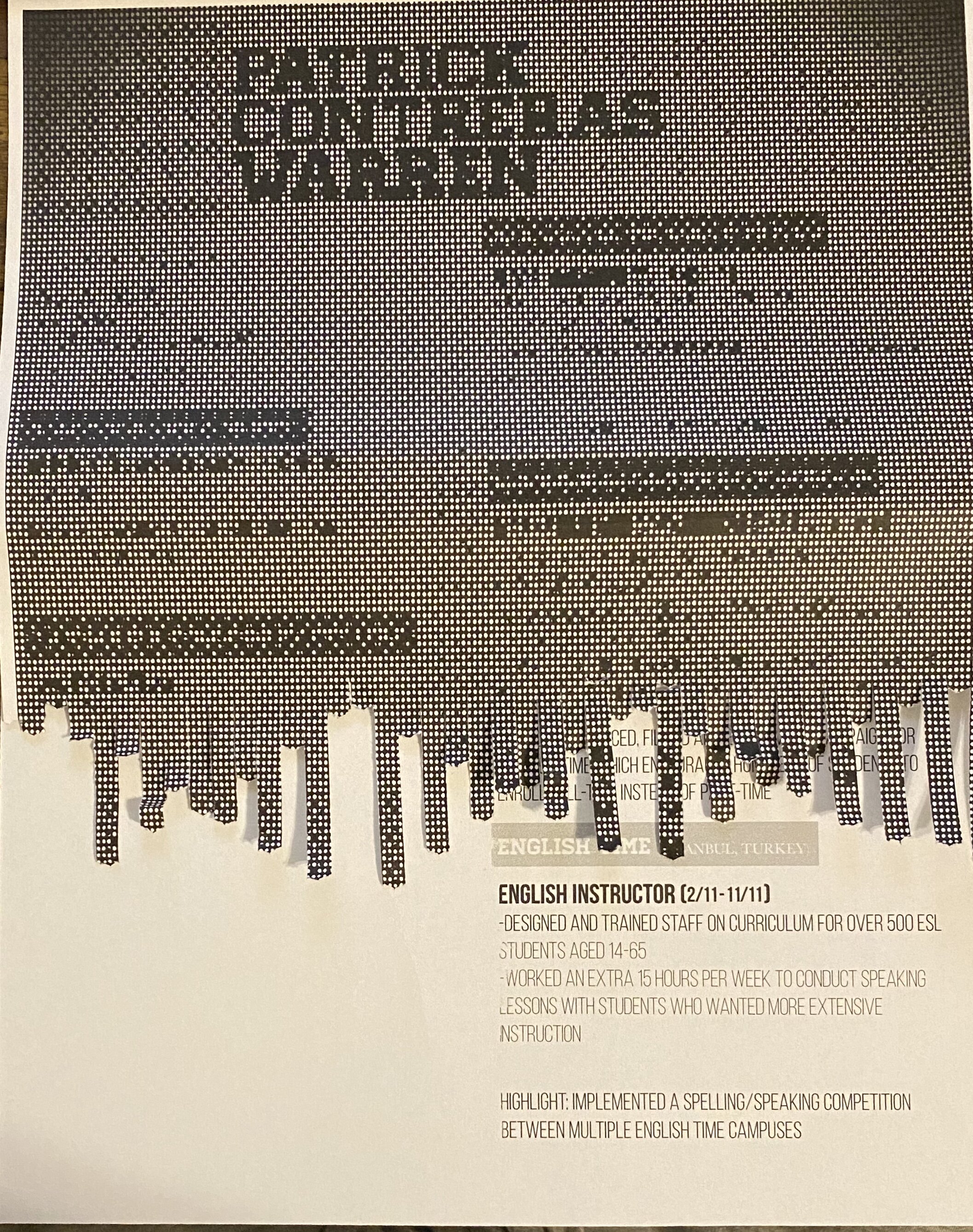
Hiring is tough. Continuing the the world from my last mediation, the hiring manager has decided that they want to remove all bias from hiring decisions. They recently had a Turkish Coffee fortune telling and they loved it so much that they wanted to replicate the experience in the office. While disposing of receipts that were questionably submitted for reimbursement, the idea of using the paper shredder presented itself.

The process:

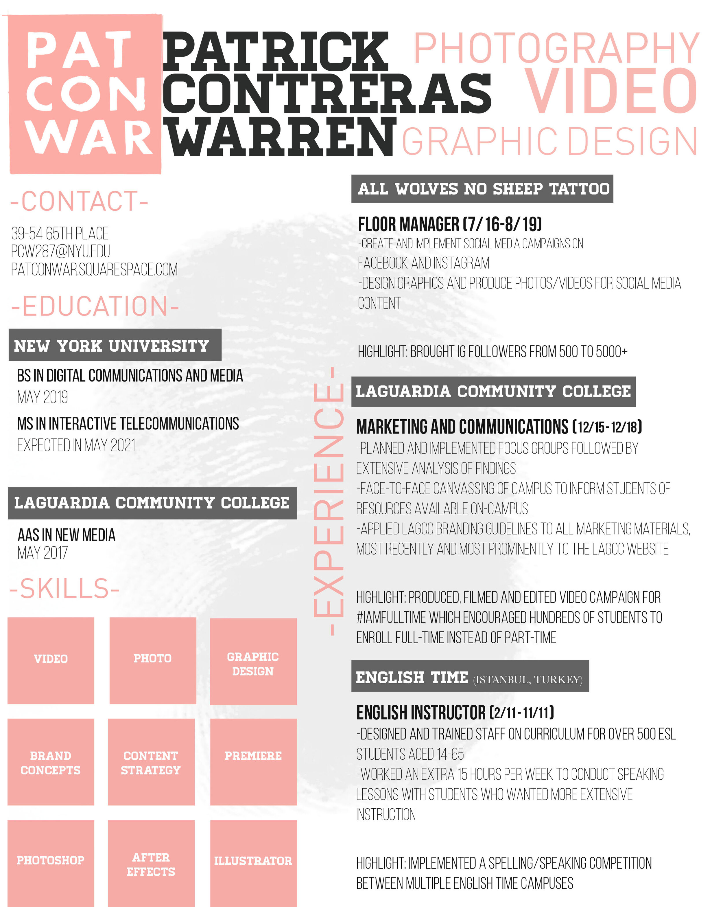
  1. Take a resume and look over it. Based on what you see, think about which section of the resume is the most noteworthy to you (Is it the work experience? Is it the education?) Remember that thought.

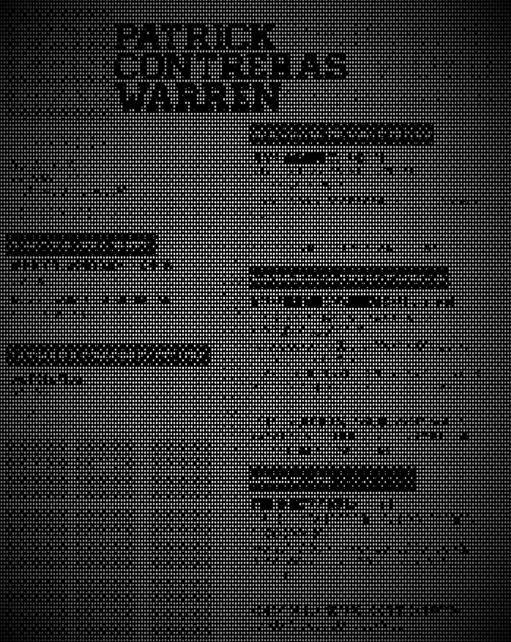
  2. Run the resume through Photomosh (a photo glitcher) until most of the text is illegible. Print this modified resume

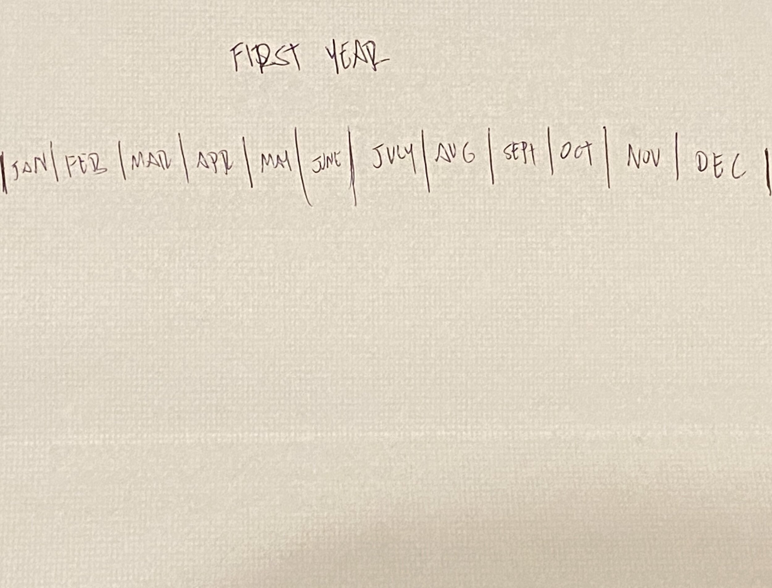
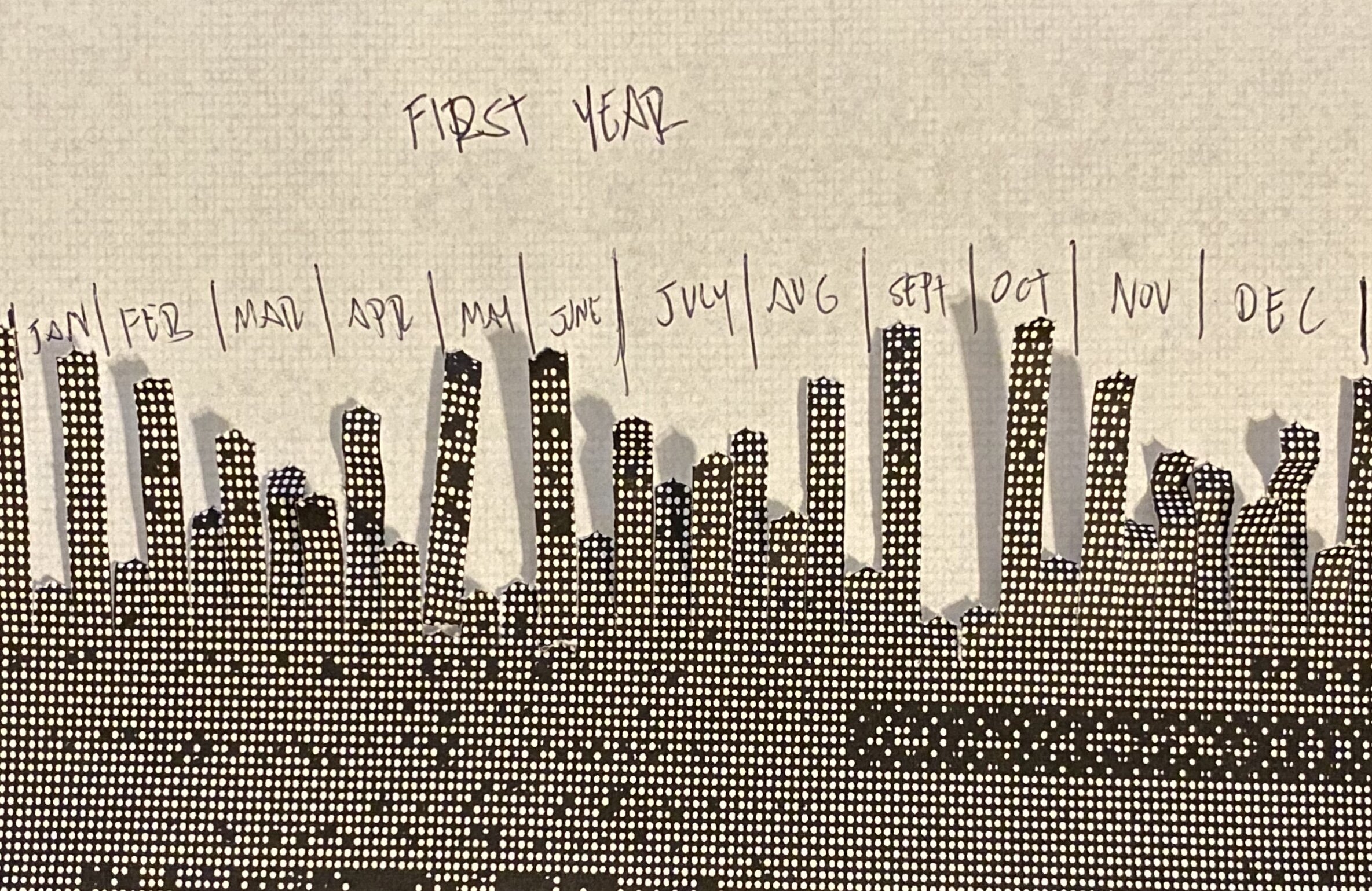
  3. On the back of the resume, create columns for each month of the year. Imagine the trajectory of the employee during these months. Keep this as a mental picture or take notes elsewhere.

  4. Keeping note of the orientation of the glitched resume (is it facing the person shredding it? is it going in top first?) run it through the shredder but stop it at some point and run the shredder in reverse to keep the shape of the shreds.

    [Notes for Orientation of Shred]

    Facing Person Shredding - The applicant will lean toward working with others

    Facing Away from Person Shredding - The applicant will lean toward working alone

    Top of Paper goes in first - The applicant will dive straight into work

    Bottom of Paper goes in first - The applicant will be cautious when starting the job

  5. Lay the glitched, shredded resume over the original resume, where the shred lines reveal the original resume indicates that this is the noteworthy area of the resume. Does it line up with what you thought? If not, does this change your mind? Why or why not?

  6. Turn the shredded resume over. Fold the shred line back so that the peaks line up with the columns for the months that were written on the back. The lines formed by the shred indicate the predicted trajectory of the applicant in their first year on the job. Does this line up with what you thought? If not, does this change your mind? Why or why not?

    =====================================

Reflection:

I actually really like this experience. When I first showed it, Allison pointed out that it wasn’t really all that toxic, and the more that I talked to people about it, that seemed to be the general consensus. I think that working in the space to interact with the “reading” and either galvanize or change initial impressions formed on the original resume. I think that the process of glitching the resume is a really engaging step in the process. It literally gets the viewer to look at the resume in a different way, probably in multiple ways since it takes a few passes through PhotoMosh to get something illegible enough to proceed. In the end, there’s space to completely throw out all of the reads made by the Shreddermancy, but in doing that, your own thoughts have been more fully developed.

Meditation #1: Stress Manager

For this assignment, I’d like to propose it from the perspective of a sort-of dystopian world that I’ve been imagining as a theme for my projects. Imagine a corporation that has suddenly become obsessed with self-help articles that can be found in abundance on social media outlets like Facebook. Articles that make broad claims such as Hugging for 20 Seconds a day can release oxytocin and instead of citing any scientific studies, they link to other blogs or even back to other articles on their own site. Imagine that this corporation decides that having their employees engage in these activities will increase profits (because they found an article that linked happy workers to more efficient workers.). Now imagine that this corporation mandates that these self-care measures be implemented into the work routine, but in the most corporate way possible. Here is an entry from this universe, it’s a tool meant to be used at the work desk called “The Stress Manager”.

Mockup sketch of the “Stress Manager”. There is a computer, keyboard and a mouse. On the monitor is the word “Stress” and on each side of the keyboard, there are copper boards. It is indicated that there would be an Arduino behind the monitor.

Mockup sketch of the “Stress Manager”. There is a computer, keyboard and a mouse. On the monitor is the word “Stress” and on each side of the keyboard, there are copper boards. It is indicated that there would be an Arduino behind the monitor.

In the sketch above, there are two copper boards placed next to a computer keyboard and they are connected to an Arudino behind the monitor. The idea of the “Stress Manager” would come from an article that suggests that taking time to do nothing can help you get more done. In this scenario, the corporation decides that they can spare a minute every hour, but instead of giving a whole minute at once, and risking a break in productivity, they decide that 10 seconds every 10 minutes would be ideal for their bottom line. With “The Stress Manager”, an employee in the middle of work, would have their screen filled with the word “STRESS” with a bright red background. Their keyboard and mouse would also deactivate while the word is on the screen. The only way to remove the word is to place both hands on the copper plates and hold them there as the red fades to white and the word disappears.

The inspiration for the visualization of this piece came from an episode of Radio Lab called “Sex-Ed”. The following snippet explains a woman dealing with pain from cramps.

======================

MOLLY: In that moment, Sindha became 11 years old again. It was her first period, and the pain was terrible.


SINDHA AGHA: I was laying in bed. My mom couldn't be there. And she was, you know, almost always there but she had to be at work and I was having really bad cramps. So it was my dad and my uncle leaning over me trying to help me, and I was just, like, mortified but I was in too much pain to, like, really worry about it. And my dad turned on Gregorian chants and he burned some incense and he started waving it over my head and he was saying, like, "Just track the smoke with your eyes and just follow it. Follow it. Okay. Imagine you are the smoke and you're just floating." And I was really committing to this. I was like, "Okay, I'm the smoke!" And then he was like, "Okay, close your eyes. Imagine a color. What color you seeing?" I was like, "Red." Obviously, because I was on my period.


MOLLY: Sindha realized in that moment she could actually see the pain. It was a thing that had a shape to it that she could identify.


SINDHA AGHA: And then he's like, "Okay, and now try to change it into a different color with your brain." And I was like, "I guess blue."


MOLLY: Sindha found herself thinking back to that moment, and once again talking to her dad and trying to transform the color of the pain.


SINDHA AGHA: I remember standing on the little staircase that leads up to the plane, and I was, like, gripping onto the bar trying not to fall over and, like, gritting my teeth, just like clenching my jaw. And I was just like, "Okay, the color red. Okay, I see it. Yeah, I see it. All right. Okay, come on. Turn into something else. Pink maybe. Okay. All right, whew!"

======================

Reflection:

It’s strange how I’ve designed this assignment from a pretty toxic point of view, where the base is an exploitation of self-care techniques. Even knowing all of that and going into the experience with that knowledge, there was still some peace and enjoyment to be found in the experience. I could actually picture myself enjoying this in a workspace, even with the micromanaged time schedule of it. I still think it’s a gross abuse of power, but maybe that’s the point; These corporations could serve give you seconds of peace, and even though you deserve hours of it, you’ll take the seconds because you still enjoy peace. The corporation gets to look like they care and somehow you feel indebted to them.

Link to p5 sketch (only works with “The Stress Manager” attached)

AR Experience Mockup

I would love to create something that allows people to easily create and place AR versions of themselves. I initially came to this idea and as way to agitate gentrification. The thinking is that when people are priced out of a neighborhood, after the immediate concerns of finding housing and rebuilding their lives, there’s got to be a fear that everything that they did to contribute to the neighborhood would also be erased. There are memories and stories that gentrification erases forever. Even someone who dies in a neighborhood at least has the chance of being remembered as a ghost. That’s it, AR Ghosts!

If you have a a resident who has been, or is about to be, priced out, what if that person gave a walking tour of the neighborhood as it is/used to be. This would serve multiple purposes:

  1. Celebrates the culture that exists/existed in the space before the gentrifiers

  2. Informs conscious gentrifiers of the culture that they should learn to honor instead of replace

  3. Serves as a “Fuck You” to gentrifiers who don’t care about the damage they do

Keep_Hoods_Yours_Mockup_3.jpg
Keep_Hoods_Yours_Mockup_2.jpg

Showing these 3 images to a classmate was somewhat helpful. They understood what was happening in each frame. They understood that the first frame was the start of an experience, but didn’t quite recognize that the street sign was being scanned to get it going. The next two frames, it was clear to them that the person in the frame of the phone was added in AR and not really on the street with the person holding the phone.

They liked the concept of taking people from neighborhoods that have been, or in danger of being gentrified and having someone native to that neighborhood sharing a narrative that captures the culture of the place as it was (before it’s replaced.).

TokoToko - A Journey to Augmented Creativity
TokoToko_banner.png

For my first case study, I played Toko Toko - A journey to augmented creativity. In searching for examples of augmented reality to study, I wanted to find something that went beyond “oh that looks so cool!” Mainly, I was looking for something with a narrative to it, whether it was a movie or a game. Toko Toko is a game where you’re helping an aspiring artist, Hako, find her creative inspiration. You do this by sharing your own real-life drawings with her. Based on what you draw for her, she’ll have guesses as to what they look like and she’ll even find creative uses for them. My first task was to draw hats for her, and while none of her guesses were completely accurate, I could see how my doodles looked like what she saw.

The game has you choose a flat plane to work on, I think I initially made the mistake of choosing an essentially textureless white table that made it hard to track. Because of this, my play circle started drifting as I was playing. I also think that my iPhone 7 might’ve had something to do with it, maybe it’s time for me to upgrade.

As to whether this piece was a sensible use of AR, I think it worked really well. It wasn’t a distraction from the narrative and, aside from the drifting (which I think is more my fault [but hey! learn to teach your users how to use your product!]) it was a really pleasant experience that fit my criteria of something that was more than just cool-looking.

There’s something about playing the game in a public space that still has me feeling a bit self-conscious. There was a point where the game had me pointing my phone in the direction of someone I didn’t know, so I was worried that she thought I was filming her. I explained that I was playing a game before she asked anything, but I would’ve rather not been in that situation. I imagine as AR becomes more prevalent, people would have less reason to feel awkward about it, but I’m definitely not at that point yet.

The overall design of the game made it easy to feel a connection to the plot and the characters almost immediately. They’re cute little characters looking to you for help. The way that the game takes your drawn assets and incorporates them into the game is a seamless transaction that is highly satisfying. The extra touch of having Hako guess that my sorry excuse for a Basquiat-esque crown was blades of grass, and then put it on her head anyway was a huge highlight. I definitely plan to spend more time playing this game, just maybe from the comfort of my home instead.

tARot

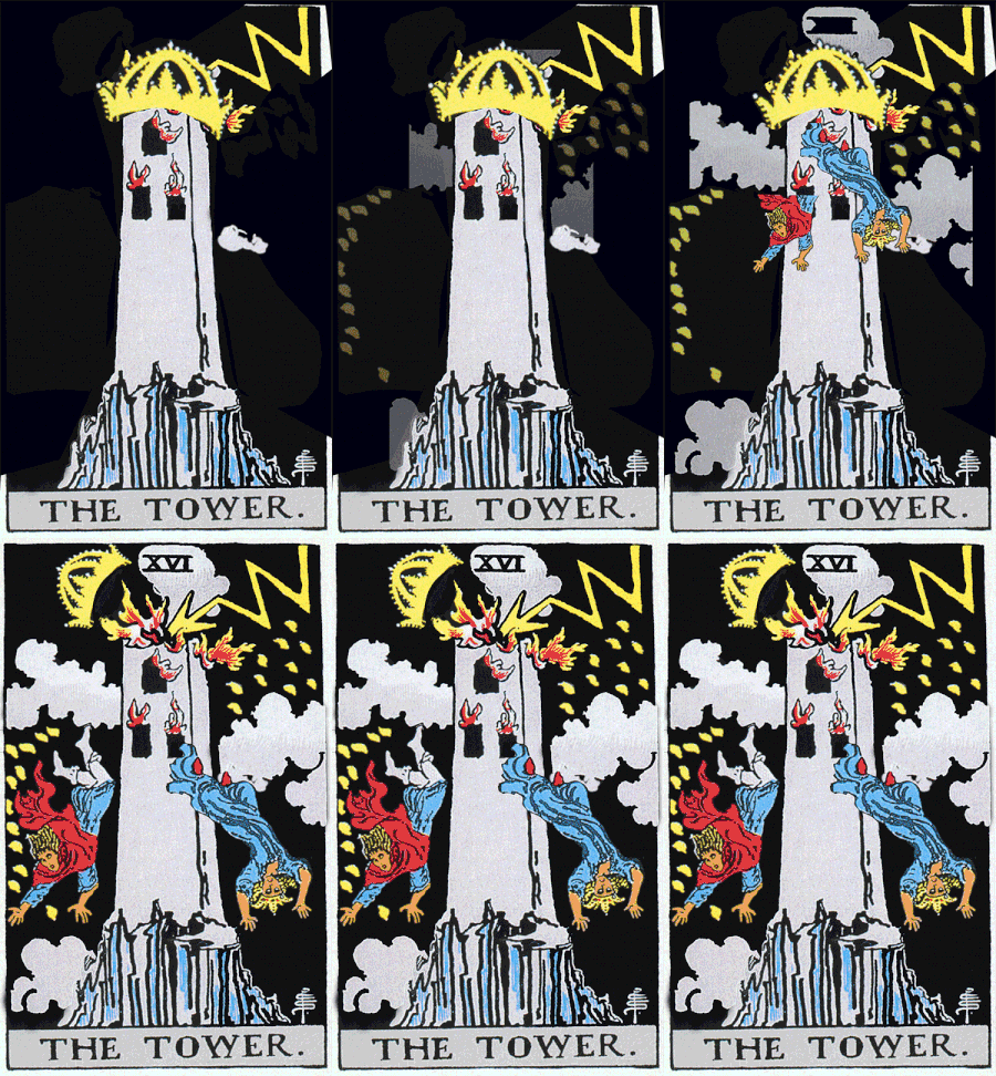
This project was really satisfying. Christina approached me with the idea and I was instantly excited about it. I think we worked very well together. Christina isolated pieces of the cards in Photoshop, I animated them in After Effects and Christina put them into Unity. The simplicity was nice and the final product was such a smooth experience.

Tarot Cards animating in Augmented Reality, a project by Christina and myself.

tower_small.gif
star_small.gif
death_smaller.gif
Shadow

For this assignment, Stacy and I thought it would be fun to mix live action and After Effects. Stacy came up with the idea of shadow puppets coming to life, and we kind of just ran from there. A lot of the fun of the video is in the sound effects and Stacy did an amazing job of making those choices. I animated the shadow and enjoyed it quite a bit. For scenes where the shadow had a figure to it, we used footage that we either found online or shot ourselves, rotoscoped the figure, killed the saturation and brightness, feathered the shape and then lowered the opacity. It worked well for the most part. There are a few scenes where there were some artifacts showing in the final render that I didn’t see on the timeline when I was editing. I’ll have to look deeper into the project to figure out what’s happening.

Shadow, a short film by Stacy and myself

Motion Picture

For this project, I worked with Nok and Sydney. Since the assignment was to have something that looped, we brainstormed different ways to play with that concept. We landed on an idea where someone became a picture that they were looking at, so the loop became a part of the narrative in that way.

The story starts out in regular video, but as soon as the character makes contact with a portrait on the wall, everything becomes stop motion. Birds come out of the portrait, put the character to sleep and take a mask from the portrait to put onto the character, seemingly to trap the character in the portrait that they were just looking at.

ICM and PCOMP Final: Santa's Zombie Boot Camp

This was a shared between project with Martin Martin and I. It was a Physical Computing final for both of us, and also an Computational Media final for me. This blog will focus on the ICM aspects of the project. For the PCOMP take on the project, visit Martin’s blog (link here)

Santa’s Zombie Boot Camp

p5 Sketch (link here)


This project was tough. I had an idea of what I wanted, and I didn’t think it would be too far from what we had for the midterm (link here) but I was wrong. I decided to remove the jump mechanic from the game because it didn’t make too much sense for our zombie to jump, and we added a Santa theme to the game which called for almost a complete redesign.

Getting the physical components together was frustrating, but not overly difficult. If anything it was just a little more time consuming. Thinking that most of the work would be on the physical side, we didn’t leave too much time for the coding. This was a mistake. I think with more time and less pressure, I may have been able to work my way out of coding challenges on my own. Luckily, we have people at ITP like Max Da Silva and Aditya Jain. They were immensely helpful in getting this game to the place that it is at.

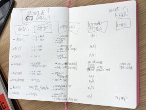
Something that helped this time was just making a list of my goals for the code. There were a lot of small tasks to accomplish, so having them laid out in a checklist helped me keep from feeling overwhelmed.

A List of Coding Goals for the game that breaks up the functions and addresses the general scope of the project

A List of Coding Goals for the game that breaks up the functions and addresses the general scope of the project

One of the issues that I ran into was getting the gifts to spawn when the Zombie got close enough to Santa. I was able to define the range in the code and even have it print “gift delivered!” every time the objective was met, but I couldn’t figure out how to make the pictures of presents show up a that point. Aditya helped me create an array for that and just clean up the experience overall.

Aditya also helped me figure out an issue with our start button and foot stomps. With my code, every time either of those sensors were activated, they would do so on the draw loop in a rapid-fire succession. I didn’t know how to get around that, so Aditya showed me how to use a throttle to have those sensors write once every second, which was key in having the game run properly.

Max helped us get the serial communication into our code. We had most of it there from our midterm, but we were having trouble with our gyroscope when we added it in. Max helped clean up our code to make that work.

Screen Recording of Santa’s Zombie Boot Camp

Alvaro playing Santa’s Zombie Boot Camp

ICM Sound Experience

FANTASIA!!

For this project, Douglas and I spent a lot of time conceptualizing before we started coding. We looked at exploring the circle of 5ths, working with chords, making a harpejji, and many other ideas. When looking for examples online, we actually came across a project by ITP 2nd Year Student, Adi Dahiya in where he used posenet to make a soundboard. We loved the idea and decided to iterate on it. His version played sounds that he loaded in, sound effects like a minion from Despicable Me and other sounds. We wanted to do something similar, but with oscillators instead.

So instead of a sound board, we made a keyboard that played the notes from C4 - C5 (skipping the half steps along the way, only keeping 8 notes). The way it works is you place your wrist over the note that you want to play, and dropping your nose below the halfway mark of the screen plays the sound, while raising the nose above it cuts the sound. I thought it was pretty fun to see someone bobbing their head to play the notes on our instrument. During play testing, I thought that the black nose on Douglas gave him a bit of a Mickey Mouse look, so we added the Fantasia hat and Mickey Gloves to perfect the look.

Here’s a link to the project.

https://editor.p5js.org/patconwar/sketches/4z70lmERf

Play Test Video

Fantasia themed keyboard coded with p5 and posenet to create a 8 note keyboard played with hands and nose.
P-Comp Paper Prototype!

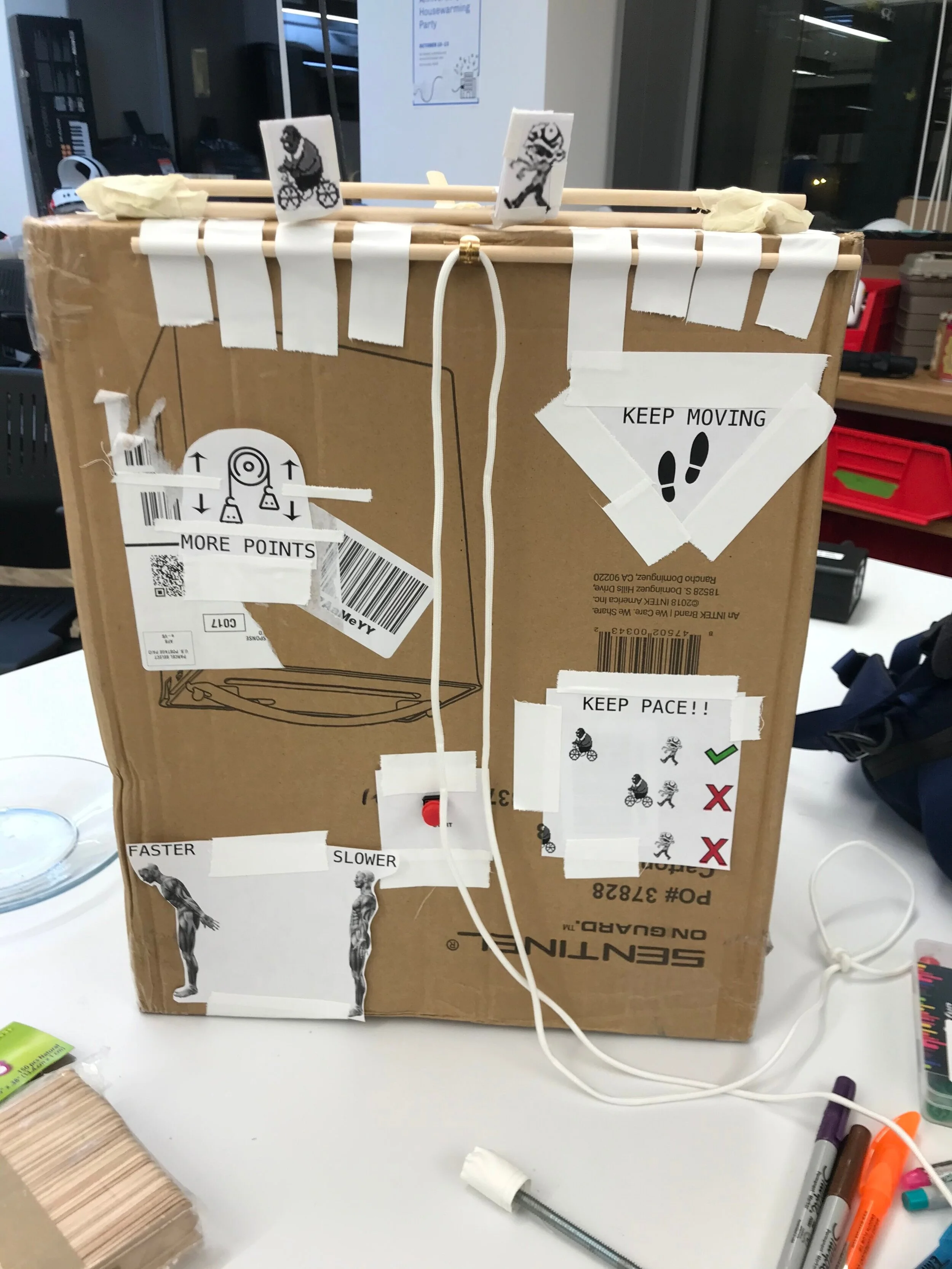
For our paper prototype we mocked up an analog version of our game.  Using a bunch of popsicle sticks, dowels, tape and printouts, we were able to replicate at least the bare idea of our game.  

This took a lot of thought and maybe assumption on our parts in order to figure out the best approach.  There were a few issues where we had differing opinions on how people would interact with the prototype.  We imagine that these issues will be resolved with the help of user testing that happens in class. 

To replicate the motion of the characters, we’ve used print outs on popsicle sticks that we’ll move based on the footsteps and the angle that the user is leaning. 

For the gyroscope, we’re thinking that something akin to a bolo tie that leaves the sensor close to the body would be most effective.  By placing the sensor behind the neck, and having the user tighten the tie, we can keep the gyroscope in place and keep the reading close to accurate. 

We’ve printed out instructions on how to play the game and tried to be as minimal as possible to avoid over-explaining.  We used icons with minimal language, hopefully that’s enough. 

Our prototype doesn’t reflect the actual position and spacing that we imagine the final product will have, but for the purpose of an analog version, we felt that this configuration would get us closer to the user experience. 

front+view+of+Zombie+Christmas+paper+prototype
footprint printouts for mock foot sensors
placement for mock gyroscope
how the bolo tie will work to secure the sensor
indicator showing that the player should go faster (the other side says slower with a red circle)
OBEY, what I say

This week I worked with Vanessa on a color experience. For our inspiration, we went with something that Felipe Pantone posted on Instagram (link here) where they printed Cyan, Magenta and Yellow (CMY) values individually onto separate glass panels, suspended the glass by cables and then moved them to show the relationships between the colors.

To replicate this effect, we had to change the blend mode in p5 to “DARKEST” which allowed the CMY values to blend and create the desired colors. We used the Obey Giant logo by Shepard Fairey because it’s easily recognizable and it’s all one color, making it easy to create CMY versions. We then found a song called “The Obedience Song” by Craig Louers on YouTube (link here) that gave the sketch a somewhat jolly/creepy vibe that was interesting.

By moving the mouse along the Y-Axis, the three different colored grids are moved in different ways, by moving the mouse on the X-Axis, the scale is altered.

The sketch can be found here.

Faking the News 10.28.19

Cheap Fakes

In the first meeting of Faking the News, we talked about what constitutes “Fake News”, but really Misinformation vs Disinformation. Where misinformation comes from inaccurate data, disinformation is intentionally deceptive. Misinformation can be utilized to disinform, and disinformation is often confused for misinformation or even accurate information. We also talked about protections for satire and where that line can/should be drawn, or if there should even be a line on that at all.

It’s impossible to live in America and think of fake news without thinking of Donald Trump, so I decided to use Videogrep (link here), a command line tool in Python by ITP Alum Sam Lavigne. What Videogrep does is it allows the user to take a video, compare it to a text file of it’s transcript and use the tool to isolate specific phrases in that video and create separate clips of those phrases. I used an hour-long speech from Trump (link here) and never had to watch more than 10 minutes of it. All I had to do was look through the transcript for words to use and then use the tool to locate the clips of those words being said in order to create my own script.

Issues

I did run into a few issues leading up to this point. Because I’m running on an older computer, I was having issues installing Videogrep. I found that my default Python was set to an older version, and even though I installed the current version, my command line kept using the older one. I had to call python by using ‘python3’ whenever I wanted to use the current version. I also had the same issue installing pip. Once Vince Shao (ITP ‘20) helped me identify the issue, everything worked as expected.

Computational Media Midterm Review

LINK TO ICM/PCOMP PROJECT “ZOMBIE BOOT CAMP”

(note, this is an updated version from the ICM midterm that was altered to fit with the theme of the PCOMP midterm)

Overall, I feel that I’ve learned a tremendous amount about computation in this first half. In struggling with p5 in different ways every week, I feel that I’m beginning to develop a sense of how to break ideas down into component steps that then makes the process of writing code a little more efficient. In the first few weeks, I relied heavily on other skills that I had (photoshop, after effects) to lay out my thoughts and hopefully be able to transfer that into code. In the past few weeks, I haven’t had to go to those steps and am finding it more effective to just go from my notes to coding as I begin to understand more.

I think that combining my PCOMP midterm with my ICM midterm helped me understand both classes a lot more. I still feel like I’m barely treading water in both, but the process of having to figure things out, ask for help, and then figure out new problems that arise after that help, forced me to figure out how I learn things. Demonstrations and reverse engineering seem to be most helpful to me, especially when my brain energy is starting to dwindle.

With my understanding on computation at this point, it feels like another took to add to my kit as a creator. Like all other tools, they have the ability to hurt, heal, or help, depending on how they are used. As far as how it relates to my creative process, computation forces me to slow down and consider the base components of everything that I’m doing. It may not be the most helpful if I’m running on a tight deadline, especially when I have tools that I’ve used for longer that I know how to produce work more quickly. I do value the idea of knowing my work on the level that computation forces me to be familiar.

Fellow ITPer Max Da Silva enjoying a round of Zombie Boot Camp after helping us troubleshoot our code.
Screen record of Physical Computing Midterm by Martin Martin and Patrick Warren. Zombie Boot Camp is a pacing game about a zombie who is trying to get into better shape with the help of legendary Punch-Out Trainer Doc Louis. Major thank you to Max Da Silva for helping debug the code!!
Physical Computing 10.17

This week, Martin and I discussed how to expand upon our midterm project, “Zombie Boot Camp” We got a lot of great feedback during the midterm when we showed our game.

  • Make it clearer that the player is controlling the Zombie

  • Make progress indicators so players know how much longer they have until the end and how well they are doing

  • Clean up the graphic movement (e.g. time jumps properly)

  • Fix music issues

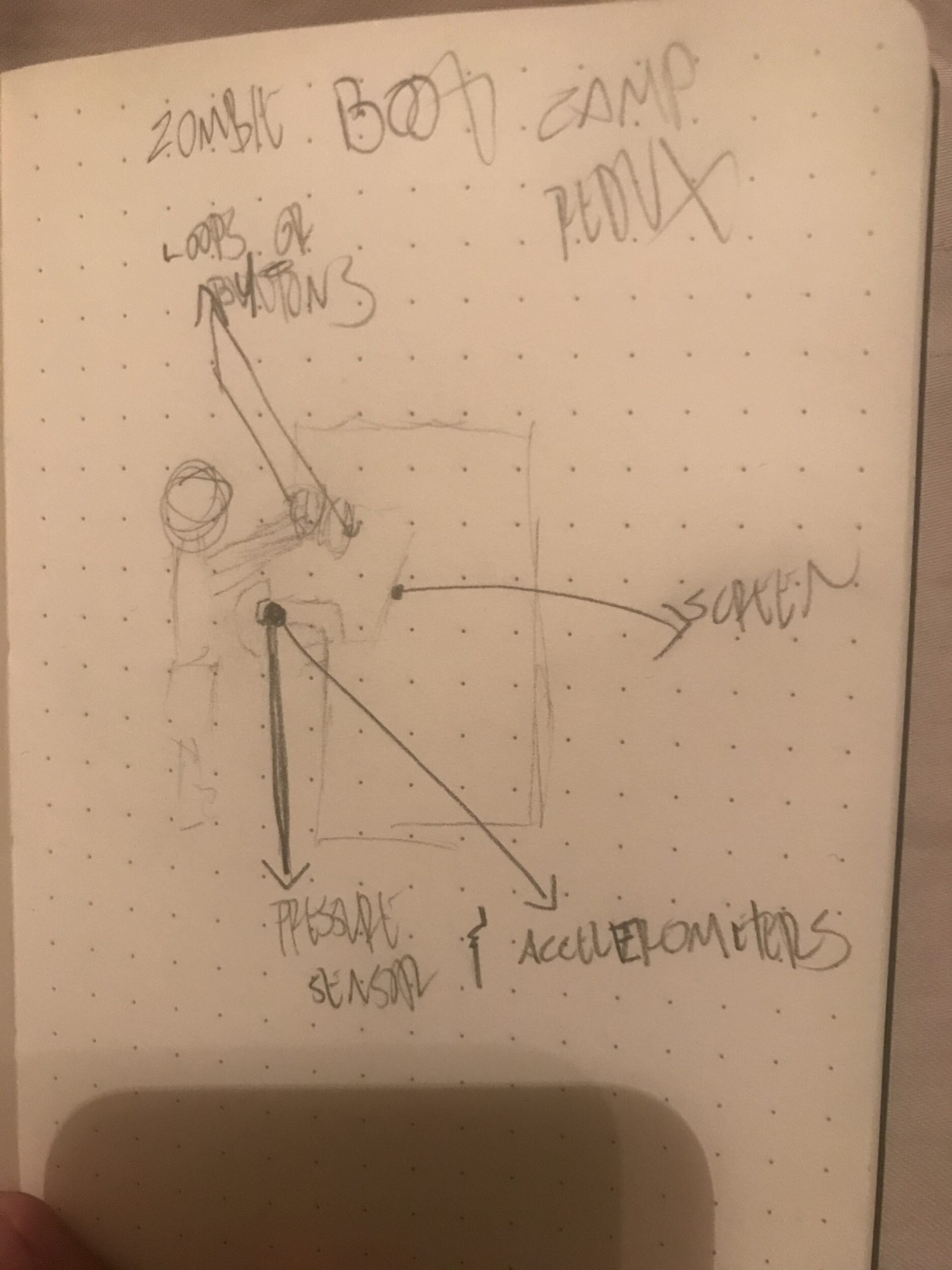
We also came up with some ideas on a more immersive control experience. We’re very happy with the controller that we made for the midterm game, for the final, we’re thinking about how to create a standing arcade game. One idea that came up is the use of a large pad for the player to lean into with their chest to control the speed of the Zombie. The more they lean into it, the faster the Zombie goes, and the less they lean into it, the Zombie will slow to a stop. To prevent players from simply using the pad with their hands, there will be an added mechanic to the game that requires the players to keep their hands out in front of them. The idea would be that anyone who is playing the game is actually moving like a zombie. For the hands, we thought of buttons, hand loops (like on the subway trains), pulleys, or even blocks that would hang down and require the player keep them balanced on their hands.

We’re still very much in the ideation phase, but it’s exciting to think about the possibilities. Here’s a rough sketch of what we had in mind at this point.

Rough sketch of what the “Zombie Boot Camp” arcade game could look like. There are indicators for a pressure sensor that the player would lean into with their chest. That sensor may also have accelerometers attached. The screen is marked where a tra…

Rough sketch of what the “Zombie Boot Camp” arcade game could look like. There are indicators for a pressure sensor that the player would lean into with their chest. That sensor may also have accelerometers attached. The screen is marked where a traditional arcade screen would be. There are also markings indicating that loops or buttons may be placed above/in front of the player to keep their arms busy.